视频地址:http://pan.baidu.com/s/1dDndx2h
input组件是数据输入的基础组件。
目录
一、综述
二、DOM结构
三、样式
四、属性
五、方法
六、事件
七、操作
八、案例
一. 综述
input组件是平台封装的一个基础控件,主要用于数据的输入和展示作用。input组件根据类型和属性的不同,能实现,数据的展示、检验、控制等操作。
组件路径:/UI2/system/components/justep/input
组件标识:$UI/system/components/justep/input/input
二. DOM结构
- 典型dom结构1
<input component="$UI/system/components/justep/input/input"
   class="form-control"
   xid="input2" dataType="Float" format="0,000.00"
   placeHolder="请填写内容"
   autoFocus="true" style="height:100%;width:100px;"
   readonly="true" disabled="true">
</input>
- 典型dom结构2
<input component="$UI/system/components/justep/input/input"
    class="form-control"
    bind-ref="testData.ref('PurchaseTime')"
    format="yyyy-MM-dd hh:mm" xid="input3" autoFocus="true"
    min="js:new Date()" style="width:100px;" >
</input>
三. 样式
- form-control
组件标识class,基础的样式定义
- input-lg
大尺寸的输入框样式
- input-sm
小尺寸的输入框样式
四. 属性
组件具有公共属性,请参考组件公共属性
- autoComplete
使用输入字段的自动完成功能,是html5新特性
- autoFocus
在页面加载时是否获得焦点,是html5新特性
- bind-ref
input组件引用的数据,input组件感知绑定数据的数据类型,当为Date、Time、Datetime时提供时间选择器
注:用Chrome模拟手机调试,默认模拟iPhone5 , 日期控件会显示不正常,改为Android类模拟正常,此现象为Chrome的模拟缺陷,真机可正常显示及操作。
- datatype
指定数据类型,当bind-ref没有定义时有效
- format
格式化,当绑定数据类型为Date、DateTime、Time时的显示格式
- min
最小值表达式,当绑定数据类型为Date、DateTime、Time时控制选择时间。
- max
最大值表达式,当绑定数据类型为Date、DateTime、Time时控制选择时间。
- maxlength
字符串类型时限制输入长度,当ref关联列中有长度定义时以ref关联列定义为准。
- placeHolder
提示信息,是html5新特性。
- disabled
禁用。
- readonly
只读。
- pattern
规定输入字段的值的模式或格式,是html5新特性,例如 pattern=”
五. 方法
组件具有公共方法,请参考组件公共方法
- clear
void clear ()
清空input数据
>参数
无
>返回值
void
>例:
//清空input数据
this.comp('input1').clear();
- val
void val ()
给input赋值或者取值,不填参数表示取值,使用绑定的data的当前行字段也可以取到这个值。可以通过js操作改变input中的值。
>参数
无
>返回值
void
>例:
//获得输入框的值
this.comp('input1').val();

//给输入框赋值
this.comp('input1').val('10000');
- set
void set (json arg)
设置属性值
>参数
arg 属性值对 json结构如下:
{
“disabled” : {boolean} 禁用,
“dataType: {string} 指定数据类型,当bind-ref没有定义时有效
“placeHolder: {string} 提示信息,html5特性
“format: {string} 格式化,当绑定数据类型为Date、DateTime、Time时的显示格式
“min: {string} 最小值表达式,当绑定数据类型为Date、DateTime、Time时控制选择时间
“max: {string} 最大值表达式,当绑定数据类型为Date、DateTime、Time时控制选择时间
“pattern: {string} 规定输入字段的值的模式或格式,html5特性,例如 pattern=”[0-9]” 表示输入值必须是 0 与 9 之间的数字
“autoFocus: {boolean} 在页面加载时是否获得焦点,html5特性
“autoComplete: {boolean} 使用输入字段的自动完成功能,html5特性
}
> 返回值
void
> 例:
//设置输入框的属性
 this.comp('input2').set({"disabled" : true});
- get
Object get (String name)
获得input属性值
> 参数
name: [String] 属性名称,取值范围:”disabled”、”dataType”、”placeHolder”、”pattern”、”format”、”min”、”max”、”autoFocus”、”autoComplete”
>返回值
Object
> 例:
//获得input组件的属性值
    this.comp('input1').get('format');
六. 事件
public void onChange (object event)[回调型事件]值变化事件
>参数
object event
event结构如下:
{
  "source" : 组件的js对象,
  "bindingContext" : 组件绑定的上下文,包含$model、$object等具体请参考bindingContext说明
  "originalValue" : 原值,
  "value" : 新值
}
>例
Model.prototype.input8Change = function(event){
  alert("原值是:" + event.originalValue + " 新值是:" + event.value);
};
public void onRender (object event) [回调型事件]显示渲染事件
>参数
object event
event结构如下:
{
  "source" : 组件的js对象,
  "bindingContext" : 组件绑定的上下文,包含$model、$object等具体请参考bindingContext说明
  "value" : input的值,
  "text" : input显示文本,可以通过修改此域修改input显示
}
>例
  //如果数据是1,显示男,否则显示女
Model.prototype.input9Render = function(event){
  if(event.value == '1')
    event.text = "男";
   else
    event.text = "女";
};
七. 操作
- (无)
八. 案例
1、输入框显示日期
(1)input组件显示data组件中的数据
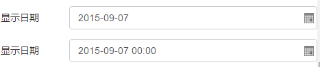
- 通过设置input组件的bind-ref属性,数据data中列的类型是date或datetime时,input组件可以变成日期格式,还可以通过format设置,控制日期的显示格式。
代码示例:
<input component="$UI/system/components/justep/input/input"
  class="form-control" xid="input6"
  bind-ref="testData.ref('PurchaseTime')"
  format="yyyy-MM-dd">
</input>
<input component="$UI/system/components/justep/input/input"
  class="form-control" xid="input7"
  bind-ref="testData.ref('PurchaseTime')"
  format="yyyy-MM-dd hh:mm">
</input>
(2)input组件不关联data组件,显示日期数据
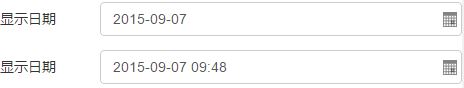
- 通过设置input组件的dataType属性,将dataType设置为:date、dateTime后,数据可以变成日期格式
代码示例:
<input component="$UI/system/components/justep/input/input"
  class="form-control" xid="input18"
  dataType="Date" >
</input>
<input component="$UI/system/components/justep/input/input"
  class="form-control" xid="input20"
  format="yyyy-MM-dd hh:mm"
  dataType="DateTime">
</input>
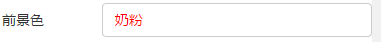
2、设置输入框字体前景色(字体颜色)
- 通过自定义的样式,可以控制输入框字体颜色。
代码示例:
/*增加输入框字体颜色的样式*/
.form-control{
   color: red;
}
<input component="$UI/system/components/justep/input/input"
  class="form-control" xid="input11"
  bind-ref="testData.ref('fName')">
</input>
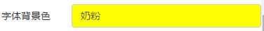
3、设置输入框的背景色
- 通过自定义的样式,可以控制输入框背景色。
代码示例:
/*增加输入框背景颜色的样式*/
.form-control{
   background-color: yellow;
}
<input component="$UI/system/components/justep/input/input"
  class="form-control" xid="input12"
  bind-ref="testData.ref('fName')">
</input>
4、设置输入框字体大小
- 通过自定义的样式,可以控制输入框字体大小属性。
代码示例:
/*增加输入框字体大小的样式*/
.form-control{
   font-size:24px;
}
<input component="$UI/system/components/justep/input/input"
  class="form-control" xid="input13"
  bind-ref="testData.ref('fName')">
</input>
5、设置输入框字体居中
- 通过自定义样式设置字体居中显示。
- 增加字体字体居中的样式
代码示例:
/*增加字体字体居中的样式*/
.form-control{
   text-align:center;
}
<input component="$UI/system/components/justep/input/input"
  class="form-control" xid="input17"
  bind-ref="testData.ref('fName')">
</input>
6、设置输入框字体右对齐
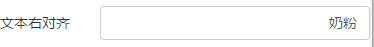
- 通过自定义样式设置字体右对齐显示。
代码示例:
/*增加字体右对齐的样式*/
.form-control{
   text-align:right;
}
<input component="$UI/system/components/justep/input/input"
  class="form-control" xid="input16"
  bind-ref="testData.ref('fName')">
</input>
7、输入框不显示边框
- 通过自定义样式设置不显示边框。
代码示例:
/*增加不显示边框的样式*/
.form-control{
   border: none;
   box-shadow: none;
}
<input component="$UI/system/components/justep/input/input"
  class="form-control" xid="input14"
  bind-ref="testData.ref('fName')">
</input>
8、通过placeHolder属性,设置输入信息的提示
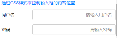
- 在开发中,我们会遇到需要在输入框上面有文字提示输入内容的需求,如:登录时,用户名、密码的提示信息。
代码示例:
<input component="$UI/system/components/justep/input/input"
  class="form-control" xid="input1"
  placeHolder="请输入用户名">
</input>
<input component="$UI/system/components/justep/input/password"
  class="form-control" xid="password1"
  placeHolder="请输入密码">
</input>
9、输入框只读属性的控制
(1)通过js代码控制是否可用
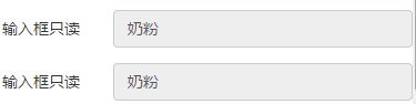
- 通过readonly属性的设置,可以控制是输入框是否可读,也可以通过js操作设置属性的值方式来控制输入框只读。
- 实现js控制输入框只读操作的代码
代码示例:
//数据加载时,设置输入框属性是否可读 true:不可以  false:可以
Model.prototype.modelLoad = function(event){
  this.comp('input8').set({"disabled" : true});
};
<input component="$UI/system/components/justep/input/input"
   class="form-control" xid="input8"
   bind-ref="testData.ref('fName')">
</input>
<input component="$UI/system/components/justep/input/input"
   class="form-control" xid="input9"
   bind-ref="testData.ref('fName')"
   readonly="true">
</input>
(2)通过设置bind-enabled属性,实现输入框的只读效果
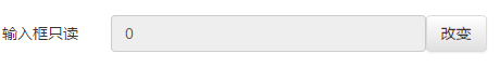
- 通过设置bind-enabled属性,实现输入框的只读效果。
- 增加一个input组件和button组件
- 在input组件上设置bind-enabled上设置表达式(由data数据控制)
- 在button上绑定点击事件(click)
- 在js中写click事件来改变data数据,从而影响输入框是否可用
代码示例:
//通过设置bind-enabled属性,设置输入框属性是否可读
Model.prototype.button1Click = function(event){
    var data = this.comp('testData');
    if(data.getValue('sex')=='1'){
       data.setValue('sex', '0');
    } else{
       data.setValue('sex', '1');
    }
};
<input component="$UI/system/components/justep/input/input"
  class="form-control" xid="input15" bind-ref="testData.ref('sex')"
  style="float:left;width:80%;"
  bind-enable=' $model.testData.val("sex") ==1'>
</input>
<a component="$UI/system/components/justep/button/button"
  class="btn btn-default" label="改变" xid="button1"
  style="width:56px;" onClick="button1Click">
   <i xid="i1"/><span xid="span1">改变</span>
 </a>
本文由WeX5君整理,WeX5一款开源免费的html5开发工具,H5 App开发就用WeX5!
阅读其他app 开发相关文章:http://doc.wex5.com/?p=3443
感觉很有用啊
赞赞赞
视频没有吗
没有视频吗
学习中