1. 组件构成
一个完成的设计器组件由以下几部分组成:
描述文件(必须),js类,java类,属性编辑器
其中只有描述文件是必须的,其他部分可以根据组件的功能进行选择。
2. 创建组件目录
Studio中设计时组件跟运行时组件都是放在一起的,但跟运行时组件并不是一一对应,如果有运行时组件目录,则在该目录下创建一个名为designer的目录,如果没有运行时组件目录,则先要创建一个组件目录,再创建desinger目录。
示例:
在/UI/system/components/grid下
3. 配置描述文件
在designer目录下创建一个xml文件,名称可以任意命名,一般情况下这个文件名保持跟组件目录名一致,xml的整体大致格式如下:
1 2 3 4 5 6 7 8 9 10 11 12 13 14 15 16 17 18 19 20 21 22 23 24 25 26 27 28 29 30 31 32 33 34 | <elements> <element> <!-- 属性描述 --> <properties> </properties> <!-- 编辑器描述 --> <property-editors> </property-editors> <!-- 内部组件描述 --> <inner-component-config> <item> <properties> <property /> </properties> </item> </inner-component-config> <!-- 菜单项描述 --> <toolbar> <item /> </toolbar> <!-- 模板描述 --> <templates> <template name="default"><![CDATA[ ]]></template> </templates> <!-- 事件描述 --> <events> <event></event> </events> </element></elements> |
根元素的名称为elements,elements下有一个或多个element节点,每个element对应这个一个设计时组件。
3.1 element属性
| 属性名 | 必须 | 描述 |
| name | 是 | 组件名称,命名必须是唯一的 |
| tag-name | 是 | 组件的标签名称,如果不确定可以写*号代替 |
| text | 是 | 组件的描述文本 |
| icon | 是 | 组件的图标 |
| java-class | 否 | 组件对应的java类,主要负责dom相关的操作,不带包名,创建在designer/dsrc下,详见第4章 |
| js-class | 否 | Js类,主要负责组件的渲染,创建在designer下 |
| discriminate-condition | 否 | 组件的鉴别条件,有些组件的标签名是一样的,必须得写上鉴别条件,可以根据某个或某几个属性值进行鉴别,支持写xpath条件,如果写xpath条件格式为executeXpath(xpath) |
| binding-component | 否 | 绑定的组件名,如:
$UI/system/components/justep/data/data |
| component-type | 否 | 组件类型,标准的有:
formControl,layoutContainer , window,data,html,可以自定义 |
| design-view | 否 | 设计视图:web-viewer,report,excel,默认是web-viewer |
| display-property | 否 | 表示在导航树上显示哪个属性的值,支持写多个 |
| visible | 否 | 表示在导航树上是否可见 |
| is-complex-component | 否 | true或者不写,设置是否是复合组件 |
3.2运行时属性描述节点:properties
属性节点主要对运行时组件的属性进行配置以便在设计器中可以对这些属性进行可视化设置properties是运行时组件的根节点,其子节点为property。
proerty的属性
| 属性名 | 描述 |
| name | 属性名 |
| text | 属性文本描述 |
| path | 属性路径,用于要设置到子节点属性的情况,如:
<property name=”data” path=”master/@data” text=”主数据”/> 这个data属性会指向当前节点下的master子节点的data属性 |
| editor-ref | 引用已经注册的属性编辑器 |
| display-name | 事件显示名称 |
| readonly | 只读,表示在属性编辑器中是只读的 |
| default-value | 默认值 |
| data-type | 数据类型:
complex,string,integer,boolean |
| required | 必填属性 |
| editor-parameter | 属性编辑器的参数,具体格式可以根据属性编辑器自身的特点自行定义 |
| is-id-ref | 是否是引用了一个id,如果为true,当目标id改变时这个属性的值也会自动跟着改变 |
| enabled-condition | 根据某个属性值控制其他属性是否可用,是一个xpath表达式,表达式返回的是一个boolean类型的值,如:
enabled-condition=”@data!=”” |
| is-virtual | 是否是虚的属性,这个属性值不值设置到文档中 |
| fixed-value | 固定值,会固定显示在属性编辑器单元格上 |
| is-style | 表示这个属性是否是css样式,如果为true那么这个属性值会自动写到style属性上面 |
说明:
1)属性分组
可对某一类型的属性进行分组,分组后在设计器中会展现为一个有层次关系的树:
如:
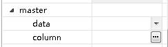
1 2 3 4 5 6 7 8 | <group name="master" text="主从选项"> <property name="data" path="master/@data" text="主数据" is-id-ref="true" type="complex" editor-ref="contextComponent" editor-parameter="data" /> <property name="column" path="master/@relation" text="关联关系" type="complex" editor-ref="dataRef" editor-parameter='{"isRelation":"true","data":"xid","hasLabel":"false"}' /></group> |
在设计器中就会展现如下图所示:
2)子属性
提供了一种子属性的功能,子属性展现的形式跟分组一样,但子属性在文档中不会存储值,子属性的上设置的值都会存放在父属性上,如:
style
width
height
。。。。。。
常用的直接放在style的子节点下
具体些写法:
1 2 3 4 | <property name="style" text="样式" editor-ref="styleDialog"> <property name="width" text="宽度" is-style='true' /> <property name="height" text="高度" is-style='true' /></property> |
子属性最终会写到父属性上,并默认以逗号分隔,如果需要指定,可以在父属性上添加一个编辑器参数属性:editor-parameter =”|”,表示用|分隔
具体展现为:

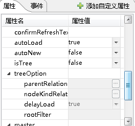
3)enabled-condition属性是一个xpath表达式,如果在分组中设置了这个属性在组下的所有属性都会有这样控制
举例:
bizData组件:
1 2 3 4 5 6 7 8 9 10 11 12 13 14 | <group name="treeOption" text="树选项" enabled-condition="@isTree='true'" checkup-condition="@isTree='true'"> <property name="parentRelation" required="true" path="treeOption/@parentRelation" type="complex" text="父关系" editor-ref="dataRef" editor-parameter='{"isRelation":"true","data":"xid","hasLabel":"false"}' /> <property name="nodeKindRelation" required="false" path="treeOption/@nodeKindRelation" type="complex" text="节点类型关系" editor-ref="dataRef" editor-parameter='{"isRelation":"true","data":"xid","hasLabel":"false"}' /> <property name="delayLoad" path="treeOption/@delayLoad" text="延迟数据加载" type="complex" default-value="true" editor-ref="booleanList" data-type="boolean" /> <property name="rootFilter" required="false" path="treeOption/@rootFilter" text="根条件" type="complex" editor-ref="" allow-empty="true" /></group> |
或者:
1 2 3 | <property name="parent-relation" enabled-condition="@is-tree='true'" required="true" path="tree-option/@parent-relation" type="complex" text="父关系" editor-ref="relationDlg" /> |
当条件不满足时,对应的属性是不可编辑的,如下图:
4)自定义属性
在属性配置列表中不存在的属性都归为自定义熟悉,在设计器中可以随意添加,如

property-editors 是属性编辑器的根节点,其子节点为:property-editor,在element 先配置的属性编辑器只能在用于当前组件,如果需要配置公共的属性编辑器则需要配置在公共的配置文件中,公共配置文件将在下面一节介绍。
property-editor属性:
| 属性名 | 描述 |
| name | 属性编辑器名称,property 元素的editor-ref属性就是对应这个值 |
| type | 有list,dialog两种类型,可以同时配置两种 |
| mutil-selection | 如果是list,可以配置这个属性是否要多选 |
property-editor 子节点:
说明:
1)property-editor数据源,配置数据源的目的是一个数据源可以绑定到不同的界面展现中,类型有:
(1) 静态数据,如:
1 | <static-data value="whereVersion,whereAll"/> |
(2) 动态数据:
- 数据从一个java类获取:
1 | <dynamic-data class-name="com.justep.studio.ui.editors.property.datasource.BizDataActionDatasource" method="getHasActionDatasource"/> |
- 数据执行一个xpath来获取:
1 | <dynamic-data xpath=”” start-element=””/> |
举例:
1 2 3 4 | <property-editor name="updatemodeList" type="list" > <!--直接定义的静态数据 --> <static-data value="whereVersion,whereAll"/> </property-editor> |
2)使用swt组件开发编辑器界面时,需要定义字节点dialog-page
1 | <dialog-page class-name="com.justep.studio.ui.editors.propertypage.ActionsCompoiste"/> |
一般情况下展现对话框会和一个动态数据源组合,列表展现会与静态数据源,xpath数据源组合,列表类型的展现只需要配置type=”list”就可以了,不需要另外写界面,对话框的需要额外写界面。
更多例子:
(1)对话框与动态数据源组合:
1 2 3 4 5 6 7 | <property-editor name="actionsDlg" type="dialog"> <dynamic-data class-name="com.justep.studio.ui.editors.property.datasource.BizDataActionDatasource" method="getHasActionDatasource" /> <dialog-page class-name="com.justep.studio.ui.editors.propertypage.ActionsCompoiste" /></property-editor> |
(2)如果不需要数据源,可以可以直接写配置对话框页就可以了,直接在对话框页代码中获取数据源
1 2 3 4 5 6 | <template name="default"> <![CDATA[ <div component="$UI/system/components/justep/data/data" autoLoad="true"> </div> ]]></template> |
在设计器界面上拖拽创建一个组件时,就会根据这个模板来生成代码
events 是事件节点的根,其子节点为:event
| 属性名 | 描述 |
| name | 事件名称 |
| text | 事件描述文本 |
| type | 有:event(脚本事件),callback(回调事件) |
| display-name | 事件显示名称 |
| template-name | 通过这个属性指定action的模板名称,模板在action配置中添加 |
| parameters | 事件方法上的参数 |
举例:
<event name=“onModelConstruct” text=“数据模型创建时“ parameters=“event”/>
注册以后可以在设计器的工具栏或者右键菜单上体现
item子节点
| 属性名 | 描述 |
| text | 文本描述 |
| method | 组件类上的方法,如果有对应的就java方法,会先调用java方法 ,方法的格式为:
public Map editData(XuiElement currentElement) 总会传入一个XuiElement元素,返回一个Map值;如果有对应的js方法最后会调到js方法,java类返回的map会作为参数传入js方法 |
| class-name | 如果不想使用组件上的方法,这里可以指定方法所在的类(只针对java类) |
3.7 复合组件子节点inner-component-config
需要将多个组件组合封装成另外一个组件的时候,如果还想使用各个组件的原有配置信息,则可以通过这个节点来配置
其子节点为item、
| 属性名 | 描述 |
| name | 子组件的配置名 |
| exclude-properties | 排除子组件的哪些属性 |
| include-properties | 包含子组件的哪些属性 |
说明:
item下可以直接按照通常配置属性的方式来添加属性或覆盖以后属性
如:
1 2 3 4 5 6 7 8 9 10 11 12 13 14 15 16 17 18 19 20 21 22 23 24 | <inner-component-config> <item name="$UI/system/components/justep/data/bizData" exclude-properties="writer,creator,columns,updateMode,directDelete,confirmDelete,relation,data,confirmDeleteText,confirmRefresh,confirmRefreshText,autoNew,nodeLevelRelation"> <properties> <property name="reader" readonly="true" editor-ref="" default-value="/system/logic/action/queryOrgAction" /> <property name="concept" readonly="true" editor-ref="" default-value="SA_OPOrg" /> <property name="offset" readonly="true" editor-ref="" default-value="0" /> <property name="limit" readonly="false" /> <property name="isTree" readonly="true" editor-ref="" default-value="true" /> <property name="parentRelation" readonly="true" editor-ref="" default-value="sParent" /> <property name="nodeKindRelation" readonly="true" editor-ref="" default-value="sNodeKind" /> <property name="rootFilter" readonly="false" /> <property name="delayLoad" readonly="false" /> </properties> </item></inner-component-config> |
3.8 include节点
通过include节点可以把其他文件的已经定义好的配置包含过来,如:
1 2 3 4 | <properties> <include path="$UI/system/components/designerCommon/commonConfig.xml#//common-properties/group[@name='bind']" /></properties> |
把commonConfig.xml文件中的bind属性配置引入到当前组件的属性中。
Path 属性 #号前面为文件路径,后面为查询节点的xpath表达式
需要在是设计器展现的组件都必须有一个js类,类文件的名称必须与xml配置文件的名称保持一致,否则类会加载不成功,这个类的作用主要是在设计器中绘制组件,一般情况下设计时组件直接继承运行时组件,通过重载或者扩展方法,去掉运行时组件的一些特性以及扩展出设计时组件所需的功能。
- 格式,以ControlGroup组件为例:
1 2 3 4 5 6 7 8 9 10 11 12 13 14 15 16 17 18 19 20 21 22 23 24 25 26 27 28 29 30 31 32 33 34 35 36 37 38 39 | define(function(require) { /*获取w文档操作接口*/ var xuiService = require("$UI/system/components/designerCommon/js/xuiService"); var xuiDoc = xuiService.getXuiDoc(); /*获取运行时的js类*/ var RTControlGroup = require("../controlGroup"); /*获取通用工具类*/ var justep = require('$UI/system/lib/justep'); /*创建设计时组件类,继承运行时类RTControlGroup*/ var ControlGroup = RTControlGroup.extend({ /*覆盖运行类的初始化方法*/ init : function(value, bindingContext) { /*调用父类方法*/ this.callParent(value, bindingContext); /*插入设计时组件的一些处理逻辑*/ this.$domNode.attr("d_canAddChild", "true"); this.set({ title : this.$domNode.attr('title') }); this._getTitleNode().attr("d_canRemove", false); this._d_inited_ = true; }, /*覆盖运行时类的属性改变后的操作方法*/ propertyChangedHandler : function(key, oldVal, value) { this.callParent(key, oldVal, value); if ('title' == key) { if (this._d_inited_) xuiDoc.updateText(this._getTitleNode()); } } }); /*返回组件映射对象,注册名与组件类的映射,支持多个*/ return {'$UI/system/components/justep/controlGroup/controlGroup' : ControlGroup}; |
- 组件操作控制:
通过给组件的dom节点设置某些属性后可以控制组件的一些通用操作,这些属性的可选值都为true或者fasle,目前有以下几种控制:
- 控制是否可以拖拽改变大小,属性:d_resizable
例如:element.setAttribute(“d_resizable”, “false”)
- 控制是否可以拖拽改变组件位置,属性:d_canMove
例如:element.setAttribute(“d_ canMove”, “false”)
- 控制是否可以允许添加子,属性:d_canAddChild
例如:element.setAttribute(“d_canAddChild”, “false”)
- 控制是否可以删除,属性:d_canRemove
例如:element.setAttribute(“d_ canRemove”, “false”)
- 控制是否可以选择,属性:d_seletable
例如:element.setAttribute(“d_seletable”, “false”)
样例/UI2/system/components/justep/cellLayout/designer/dsrc/CellLayout.java:
1 2 3 4 5 6 7 8 9 10 11 12 13 14 15 16 17 18 19 20 21 22 23 24 25 26 27 28 29 30 | public class CellLayout extends BaseComponent { /** * 设置布局内容 * @param map */ public void setContent(HashMap<String,Object> map) { } /** * excel导入. * @param currentElement * @return */ public Map<String, String> importFromExcel(XuiElement currentElement) { return new HashMap<String, String>(); } /** * 设置单元格属性. * @param currentElement * @return */ public Map<String, String> setCellProperties(XuiElement currentElement) { return null; }} |
说明:
一般在js类处理不了的情况下才需要定义java类,java部分公开的方法,参数格式:XuiElement 类型的参数 返回格式:Map ,这个方法在配置文件中的上下文菜单注册,js如果有定义同名的方法,则执行上下文菜单动作后先执行java端的方法,然后再执行js端的方式,java返回的map作为js方法的参数,如果java方法返回null,则不执行js方法。
5.1对话框类型
- 使用w页面作为编辑器界面
描述方式
1 2 3 4 | <property-editor name="classSelector" type="dialog" url="$UI/system/components/designerCommon/propEdtorPages/cssClassSelector/cssClassSelector.w" editor-parameter="{width:800,height:600}"></property-editor> |
url指向一个w页面
editor-parameter json格式的编辑器参数,这个参数值在w页面中通过特定的api来获取
w页面对应的js类标准格式:
1 2 3 4 5 6 7 8 9 10 11 12 13 14 15 16 17 18 19 20 21 22 23 24 25 26 27 28 29 30 31 32 33 34 35 36 | define(function(require){ var $ = require("jquery"), /*通用工具类*/ justep = require('$UI/system/lib/justep'), /*xui文档操作服务类*/ xuiService = require("../../js/xuiService"); var Model = function(){ this.callParent(); }; /** * 模型加载后回调事件. */ Model.prototype.modelLoad = function(event){ // 获取传入的页面参数 var initData = xuiService.getPageParams(); //做其他初始化操作... }; /** * 获取返回值,点击确定后调用的方法,必须是一个json格式的数据 . */ Model.prototype.getReturnValue = function(){ //定义返回结果,可以是一个json格式的结构,也可以是一个字符串,如果是json格式可以同时对多个属性进行赋值,如果是字符串,那么只赋当前属性 var result = {}; //返回的值写到对应的属性上 return result; }; return Model;}); |
注意:使用这种方式的编辑器不需要跟上面所讲的property-editor数据源绑定,所有数据的来源都需要w页面内独立处理
- 使用swt开发编辑器界面
继承swt的Composite,然后实现接口 IPropertyDialogPage
1 2 3 4 5 6 7 8 9 10 11 12 13 14 15 16 17 18 19 20 21 22 23 24 | public class ConceptPage extends Composite implements IPropertyDialogPage { /** * 返回Map, key为property属性名字,value为属性值 */ public Object getReturnValue(); /** * 校验属性值,如果返回不为null,说明属性值有问题。 * @return */ public String isValid(); /** * 设置当前属性对象. * @param propertyItem */ public void setPropertyItem(PropertyItem propertyItem); /** * 设置返回值的处理策略. * @param strategy */ Public void setReturnValueStrategy(IPropertyValueStrategy strategy);} |
这里实现的是基于对话框类型的编辑器,需要自定义界面,界面使用swt来开发
5.2 列表类型
列表类型的属性编辑器不需要从新定制界面,按照格式配置数据源即可即可:
(1)基于基类的数据源:
1 2 3 4 5 | <property-editors> <property-editor name="chartDataConfigPage" type="dialog"> <dialog-page class-name="com.justep.desinger.chart.page.ChartDataConfigPage" /> </property-editor></property-editors> |
(2)xpath 数据源
(3)静态数据源
(4)java数据源,返回的格式是一个List<String
1)如果是只有当前组件才使用的属性编辑器,则可直接注册到当前组件的配置文件中,如:
1 2 3 4 5 | <property-editors> <property-editor name="chartDataConfigPage" type="dialog"> <dialog-page class-name="com.justep.desinger.chart.page.ChartDataConfigPage" /> </property-editor></property-editors> |
2)如果是一个公共的属性编辑器,则可以注册到一个公共的地方,如:
/UI/system/components/designerCommon/commonConfig.xml 设置了很多公共属性编辑器。
下拉与弹出框同时出现
在组件属性上同时引用列表类型和对话框类型的编辑器,如:
<property name=”confirm-refresh” text=”刷新提示,数据修改后刷新数据进行提示” default-value=”true” editor-ref=”booleanList,actionsDlg”/>
可以同时给编辑器上的按钮配置自定义图标和文本提示:如
1 2 3 4 5 6 7 8 | <property-editor name="actionsDlg" type="dialog" tip="新建" icon="data.gif"> <dynamic-data class-name="com.justep.studio.ui.editors.property.datasource.BizDataActionDatasource" method="getDatasource" /> <dialog-page class-name="com.justep.studio.ui.editors.propertypage.ActionsCompoiste" /></property-editor> |
图标就存在当前组件的images目录下
使用场景:选择excel文件的编辑器,下拉选择已经有的excel文件,点按钮可以新建一个新的excel文件
定义组件注册文件,如:
/UI/system/components/designerComponentReg.xml
格式为:
1 2 3 | <component-dirs> /UI/system/components/resource,model</component-dirs> |
组件目录注册,可以写相对路径和绝对路径,相对路径如model,绝对路径如:/UI/system/components/resource
把组件注册到设计器的工具箱上
1 2 3 4 5 | <toolbox> <catalog name="表单" initial-state="open" design-view="excel" order="3"> <item component-name="$UI/system/components/justep/input/input" /></toolbox> |
Catalog是工具箱上的目录,属性说明:
@text 描述文本
@ order 在组件箱上的位置
@ initial-state 初始为打开状态
@ design-view 在哪个设计器视图出现,有:excel,report
Item 是一个个组件项component-name 是组件配置文件上的name属性的值。
以上都注册完以后,最后一步需要把组件配置文件注册到studio.xml中,可以使用*号通配符,如:
<component-reg-file>../../components/*.components.xml</component-reg-file>
表示../../components 目录下的以.components.xml结尾的都是组件配置文件
6.4 资源依赖
如果组件依赖了不是使用require方式加载的js或者css文件,需要在注册文件中注明
如:
1 2 3 4 5 6 7 8 9 | <!-- 依赖的css文件 --> <depend-css> <item>$UI/system/components/biz.comp.min.css</item> </depend-css> <!-- 依赖的js文件 --> <depend-js> <item>$UI/system/core.min.js</item></depend-js> |
6.5 设计时组件的加载规则
打开一个w文件设计时组件的加载步骤如下:
1)扫描UI2下第一层目录的config/studio.xml文件,如果文件存在,则解析文件内容中的component-reg-file 节点的文本所指定的组件注册文件,如system目录的配置为
<component-reg-file>../../components/*.components.xml</component-reg-file>
根据相对路径找到组件注册文件,在进一步解析注册文件所注册的组件,得到组件名列表。
2)根据第1步得到的组件列表构建组件工具箱。
- 解析w文件的内容,并收集组件定义中的component属性值,同时到 component属性值 +/designer 目录下去查找xml文件,如果有同名的js文件在加到require列表中,得到一个w所依赖的设计时组件的js文件列表。
- 把解析好的w文件发送至设计器界面中展现,同时通过require把3步得到的js列表加载到当前的页面环境中。
配置单个属性样式的方法:
通过在property的editor-parameter参数中指定,可选值为:字体、块、背景、边框、方框、定位、布局、列表、表格,*
不写或者写*号表示显示所有的。
举例:
1)<property name=”style” text=”样式” editor-ref=”styleDialog” editor-parameter=”背景”/>
只显示背景设置
2)<property name=”style” text=”样式” editor-ref=”styleDialog” editor-parameter=”字体,[背景]”/>
只显示字体,背景设置,默认选中背景,加[]号标识
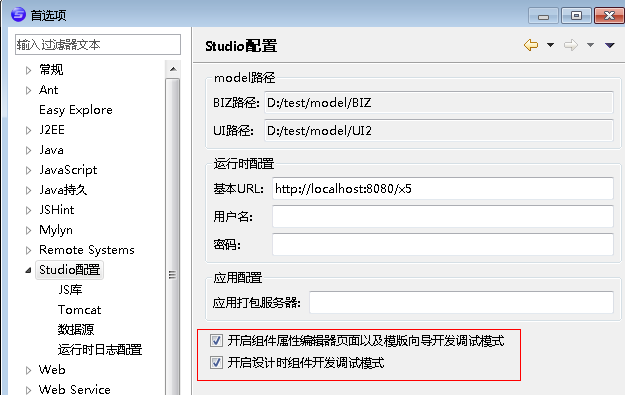
在开发组件时,如果修改组件配置文件或者js类后马上能生效,需要在studio下首选项中把debug状态打开,如:
可以在公共目录里写上属性的公共配置,在组件配置中可以直接引用这个公共配置,如样式属性:
1 2 3 4 5 6 7 8 9 10 11 12 13 14 15 | <common-properties> <property name="style" text="样式" editor-ref="styleDialog"> <property name="left" text="位置左" is-style="true" /> <property name="top" text="位置上" is-style="true" /> <property name="height" text="高度" is-style="true" editor-ref="styleHeightWidth" /> <property name="width" text="宽度" is-style="true" editor-ref="styleHeightWidth" /> <property name="background-color" text="背景颜色" is-style="true" editor-ref="simplecolor" /> </property> <property name="xid" text="编号" required="true" /> <property name="bind-ref" text="引用" editor-ref="dataRef" editor-parameter='{"hasLabel":"false"}' /> <property name="bind-text" text="文本引用" editor-ref="dataRef" /></common-properties> |
可以在公共目录里写上公共属性编辑器的配置,可以跟公共属性放在同一个目录下,用一个common-property-editors 根包起来 ,具体的编辑器配置格式跟组件内的属性编辑器配置方式一样,如:
<!– 公共属性编辑器注册 –>
1 2 3 4 5 6 | <common-property-editors> <property-editor name="xpathEditor" type="dialog"> <dialog-page class-name="com.justep.studio.ui.editors.propertypage.XpathPropertyValuePage" /> </property-editor></common-property-editors> |
评一波